Solving User Confusion in jSign's Multi-Document Workflow
Overview
When a major feature update in jSign led to user confusion and increased support calls, I created a targeted, visual microcontent solution using Whatfix. The intervention improved user clarity, reduced support requests, and showcased my strength in user-centered documentation.
🧩 The Problem
A newly added multi-document sending feature confused users, who couldn’t find their additional uploaded documents. On the document preparation screen, additional documents were hidden behind the expanded pages of the first document — a UI flaw difficult to fix with dev resources. Support tickets spiked.
💡 My Solution
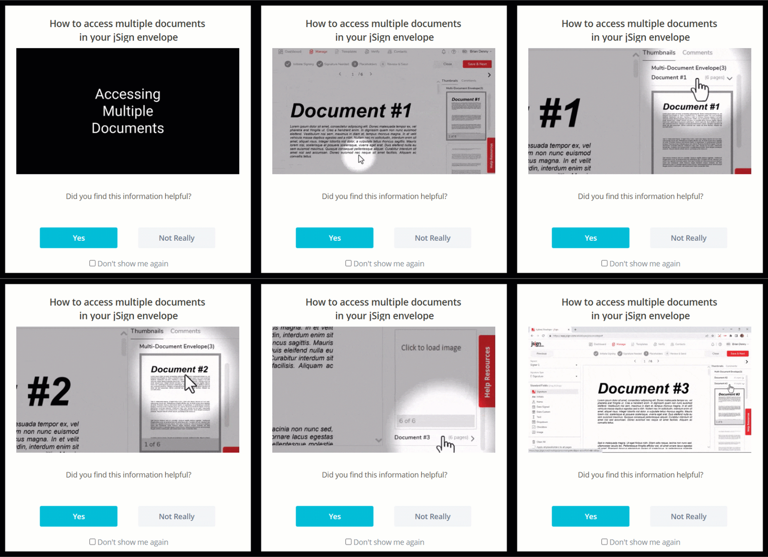
To quickly reduce confusion, I designed a GIF-based popup that visually guided users to their hidden documents:
- Created the GIF in Camtasia using clear visual cues and pacing
- Embedded the GIF in a targeted Whatfix popup, shown only to users with multiple documents using jQuery selectors
- Avoided long-form text in favor of quick visual learning
- Added a simple feedback prompt to measure effectiveness

📈 Results
- 80% of users shown the popup in early 2024 rated it “helpful”
- Coincided with a significant drop in related support calls, according to the Product Manager
This project demonstrates my ability to blend user empathy, tool fluency, and strategic content thinking to address real UX problems with light-lift, high-impact documentation.